Links
Background
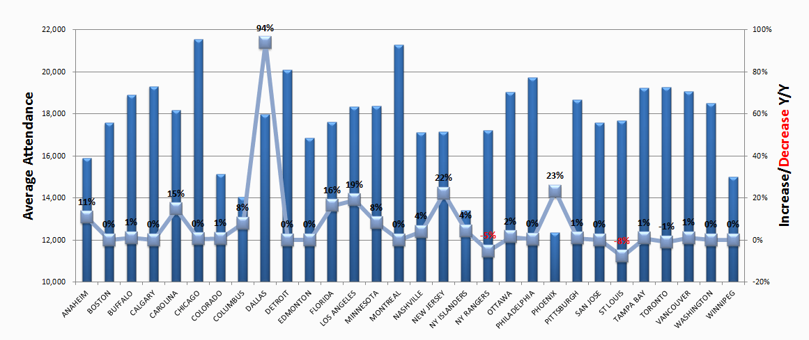
For this week, the data provided is the NHL Attendance from season 2000-01 to 2017-18 (Source: ESPN). More info on the data set can be found here. The visualization to improve on is:

Notes on the data set/original visualization
Jupyter notebook of the data exploration
The visualization shows 2 data:
- the season's average attendance per game by team
- % change of attendance compared to previous season
The data from the visualization however is probably not the full season data as it was posted on Feb 2013 while an NHL season usually last from Oct to Jun the following year.
There is no season 2004-05 due to a labor lockout. There are 30 teams participating for all the seasons except 2017-18 where there is a new addition (Vegas).
Problems with the visualization
- no indication of the season that the data applies to
- two charts are lumped into one, with 2 y-axis, which adds cognitive load to audience who have to figure out which y-axis is for which chart
- left y-axis is not zero based, making it hard to compare accurately
- a line graph is usually used to indicate connections between data points (like time-series). Using it here increases cognitive load for audiences
- Similar color choice for overlapping graphs makes them difficult to differentiate
- diagonal team names on x-axis makes it slightly difficult to read (minor)
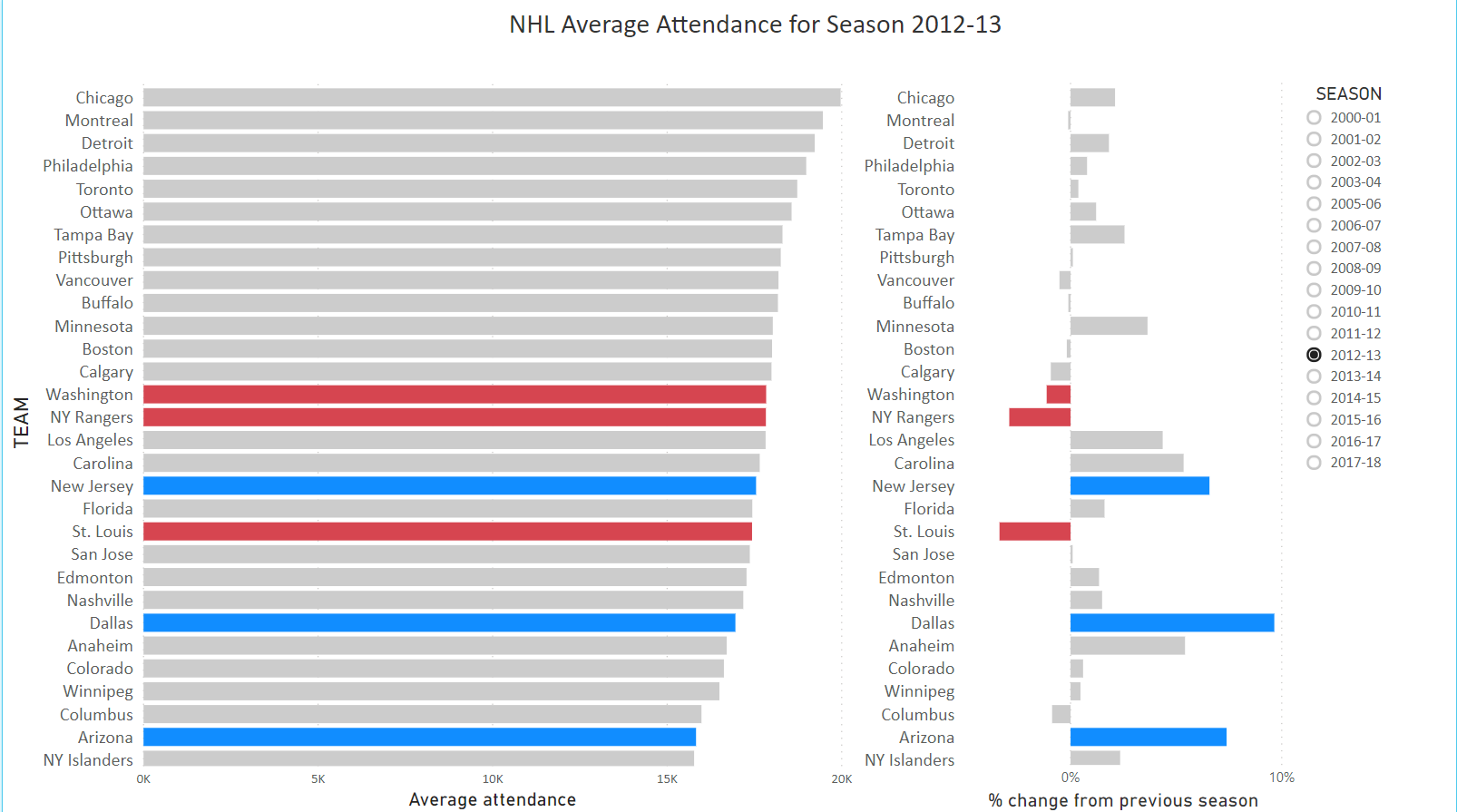
Changes
- add a title with the season indicated
- set team categories on y-axis so that they can be displayed horizontally
- separate the 2 charts
- show average attendance in sorted order
- color code the top 3 and bottom 3 attendance change and use the color coding to link data between the 2 charts
Visualization after makeover
