Links
Background
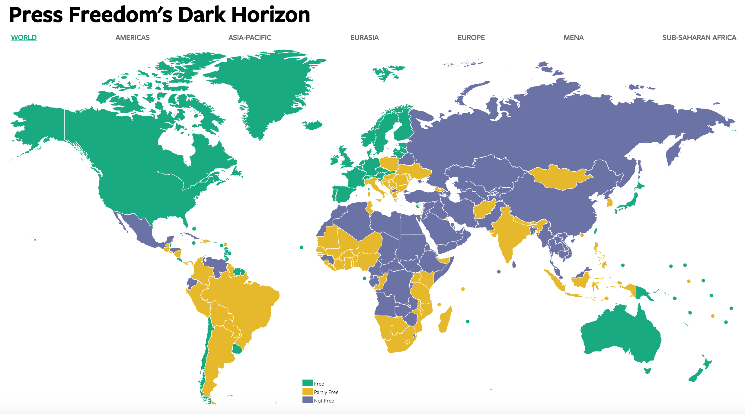
For this week, the data provided is the Press Freedom Score of various countries where their press freedom is classified as Free, Partly Free or Not Free depending on the score. More info on the data set can be found here. The visualization to improve on is:

The original visual above is interactive. Click here to access.
Notes
Jupyter notebook of the data exploration
There are 5 rows with no score. Removed them from data as they have minimal impact.
The number of countries evaluated fluctuate across the years. Western Sahara is a disputed territory.
In the data set, the following are the same geographically:
- Israeli-Occupied Territories and Palestinian Authority (before 2012 edition)
- West Bank and Gaza Strip (starting from 2012 edition)
Mapbox Visual limitations on Power BI
- Data shows Greenland as part of Denmark while in Mapbox, both are separate
- Greenland is shown to be under denmark as well
- Hong Kong is part of China in Mapbox while separate in data
- Data includes Somalialand which is not available in Mapbox
undefined - Crimea is not available in Mapbox
- Mapbox Visual is unable to show a report page as a tooltip (This functionality is available on other map visuals in Power BI)
What I like/dislike about the visualization
Likes
- clicking on a country brings you to a page that provides more in-depth information
Dislike
- the status color is not intuitive, frequent reference to the legend is required to reference press freedom status
- the legend does not give the score range that identifies if a country is Free, Partly Free or Not Free, but the score is shown when you hover over the country
Changes made
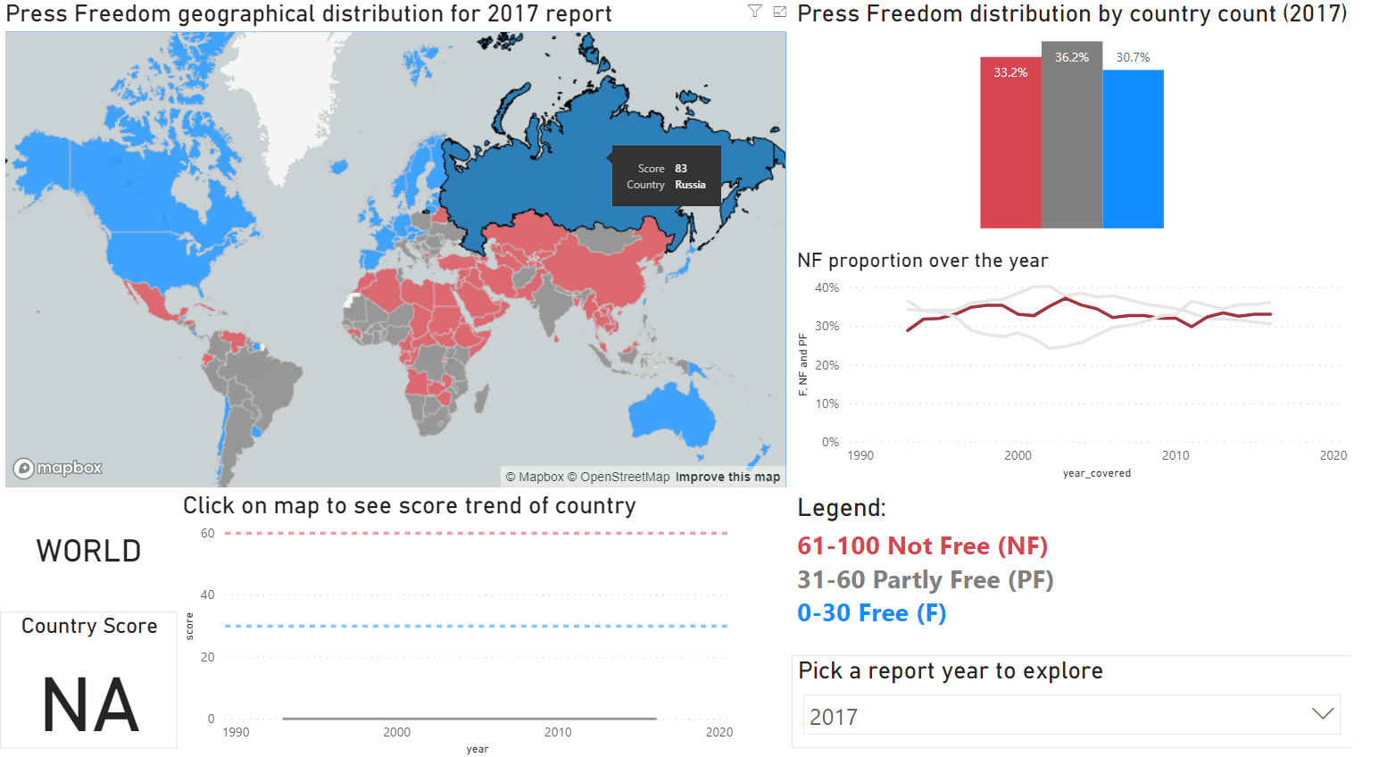
As the title of the report is "Press Freedom's Dark Horizon", I've added a graph showing the change in NF proportion over the years to show the NF trend (A more accurate visual is the change in NF by population but there is a lack of population to show the related visual). Other change includes:
- add a legend with the score included
- press freedom distribution for the report year by country count
- change the color coding to: blue for Free, grey for Partly Free, red for Not Free, white for NA
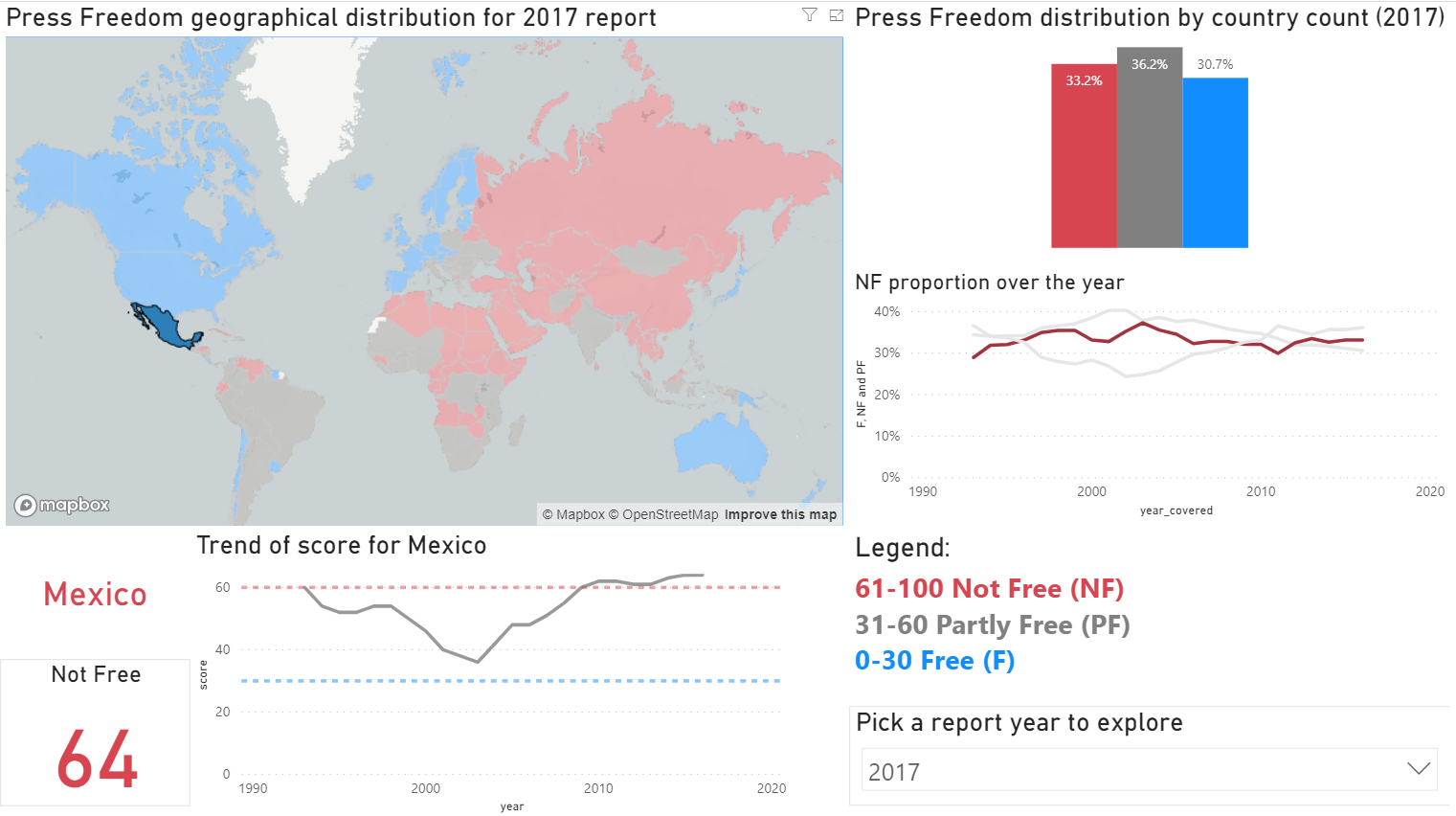
- clicking on a country on the map shows the score trend for the country in addition to the score for the current report
Stretch goal
- I wanted to relate the population number with press freedom but the data is not immediately available
Limitations of Power BI
- For the country trend, I originally wanted to color code portions of the line to correspond to its freedom status but this is currently not possible in Power BI
- Changes in granularity for line graph axes is currently not possible
- I also wanted to show country level info on hover of country as tooltip info but was not able due to limitations of Mapbox on Power BI
Visualization after makeover
Overall

Country level
